At Norvision, we have spent decades at the intersection of technology and physical space. Designing for a large-scale interactive display is fundamentally different from designing for a smartphone or a laptop. When a user approaches a 100-inch video wall or an interactive kiosk, their physical relationship with the interface changes. They are no longer just “users”; they are participants in an environment.
If you treat a massive interactive display like a giant iPad, you will fail. The ergonomics are different, the viewing distances vary, and the psychological state of a person in a public space is vastly different from someone sitting at a desk. To create a frictionless experience, you must adhere to a specific set of design principles tailored for the “big screen.”
Here are the five golden rules of UI/UX for large-scale interactive displays that we use to ensure every digital signage solution we deploy is intuitive, accessible, and engaging.
1. Respect the “Arm’s Length” Rule
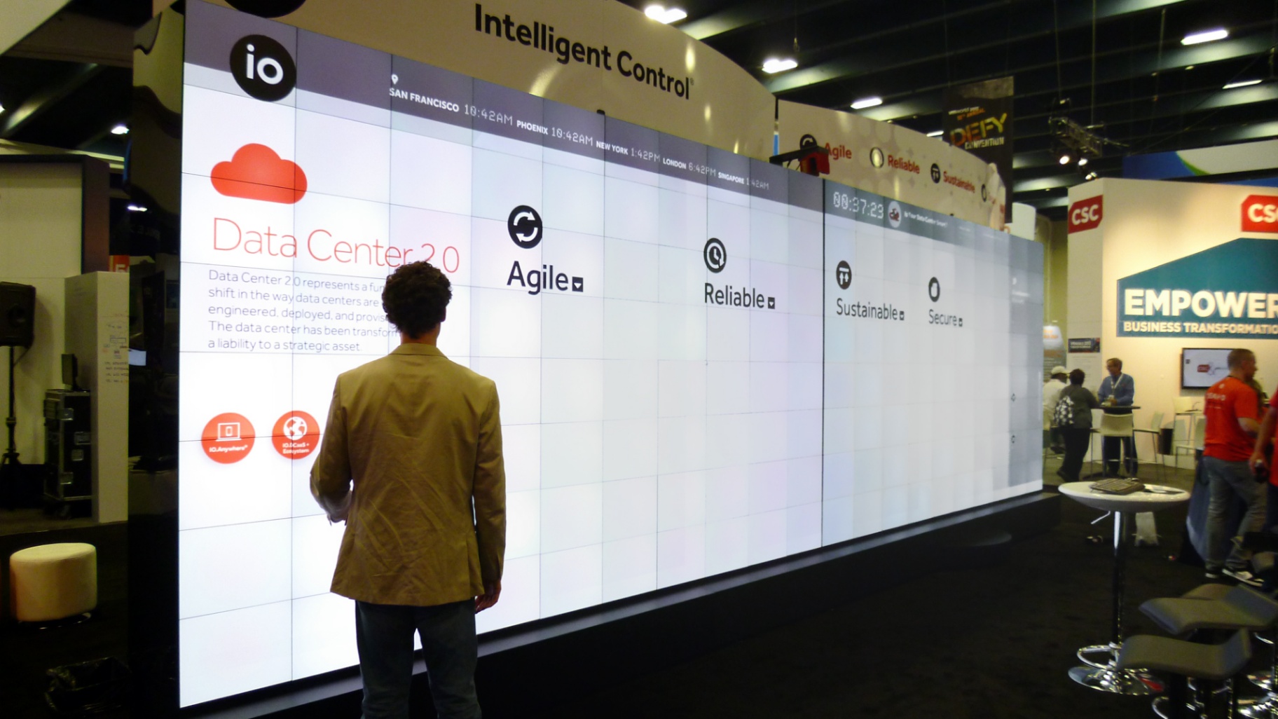
The most common mistake in large-scale UI design is failing to account for the transition between the “Attract” phase and the “Interact” phase. A large display must serve two masters: the person standing 20 feet away and the person standing 20 inches away.
When a user is at an arm’s length, they cannot see the entire screen at once. Their field of vision is limited to a specific zone. If you place critical navigation elements at the top of an 85-inch screen, the user will have to physically step back or strain their neck to find them.
How to design for physical proximity:
- The Interaction Zone: Keep all touchable elements within a “comfort zone”: typically between 30 and 50 inches from the floor.
- Peripheral Awareness: Use subtle animations or visual cues to guide the eye toward content that might be outside the user’s immediate central vision.
- The Attract Loop: When no one is interacting, use large-scale visuals designed for distance viewing. Once a touch is detected, transition the UI to a more detailed, close-up layout.
2. Prioritize Accessibility and ADA Compliance
In a public or corporate environment, your display must be usable by everyone, regardless of their physical height or mobility. Accessibility is not just a “nice to have”; it is a legal and ethical requirement, particularly under Americans with Disabilities Act (ADA) guidelines.
At Norvision, we emphasize that high-tech should never mean high-barrier. Whether we are designing a donor recognition wall or a campus wayfinding system, accessibility is baked into the initial wireframe.
Essential accessibility standards:
- Reach Range: Ensure that all interactive elements are reachable for someone in a wheelchair. According to ADA standards, the maximum high side reach is typically 48 inches, and the low side reach is 15 inches.
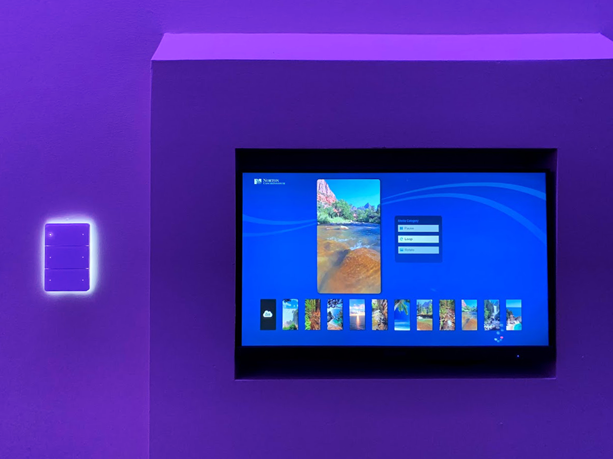
- Visual Contrast: Follow WCAG 2.1 AA standards. Ensure a contrast ratio of at least 4.5:1 for body text. Public spaces often have unpredictable lighting, so high contrast is your best friend.
- Redundancy: Never rely on color alone to convey meaning. Use text labels, icons, and tactile cues where possible.
- Interactive SkyLites: For specialized environments like healthcare, we even implement solutions like Digital SkyLites, which prioritize calming, high-contrast visuals that are easy for patients to navigate during stressful moments.
3. Optimize Touch Targets for Human Anatomy
On a desktop, a mouse cursor is a precise pixel-perfect tool. On a large interactive display, the “cursor” is a human finger. This requires a significant shift in how you size and space your buttons. “Fat-finger” syndrome is the leading cause of user frustration in interactive signage.
If a user tries to tap a button and accidentally hits the “Back” button next to it, they will likely abandon the session. Keep it simple. Ensure your touch targets are generous.
Rules for touch interaction:
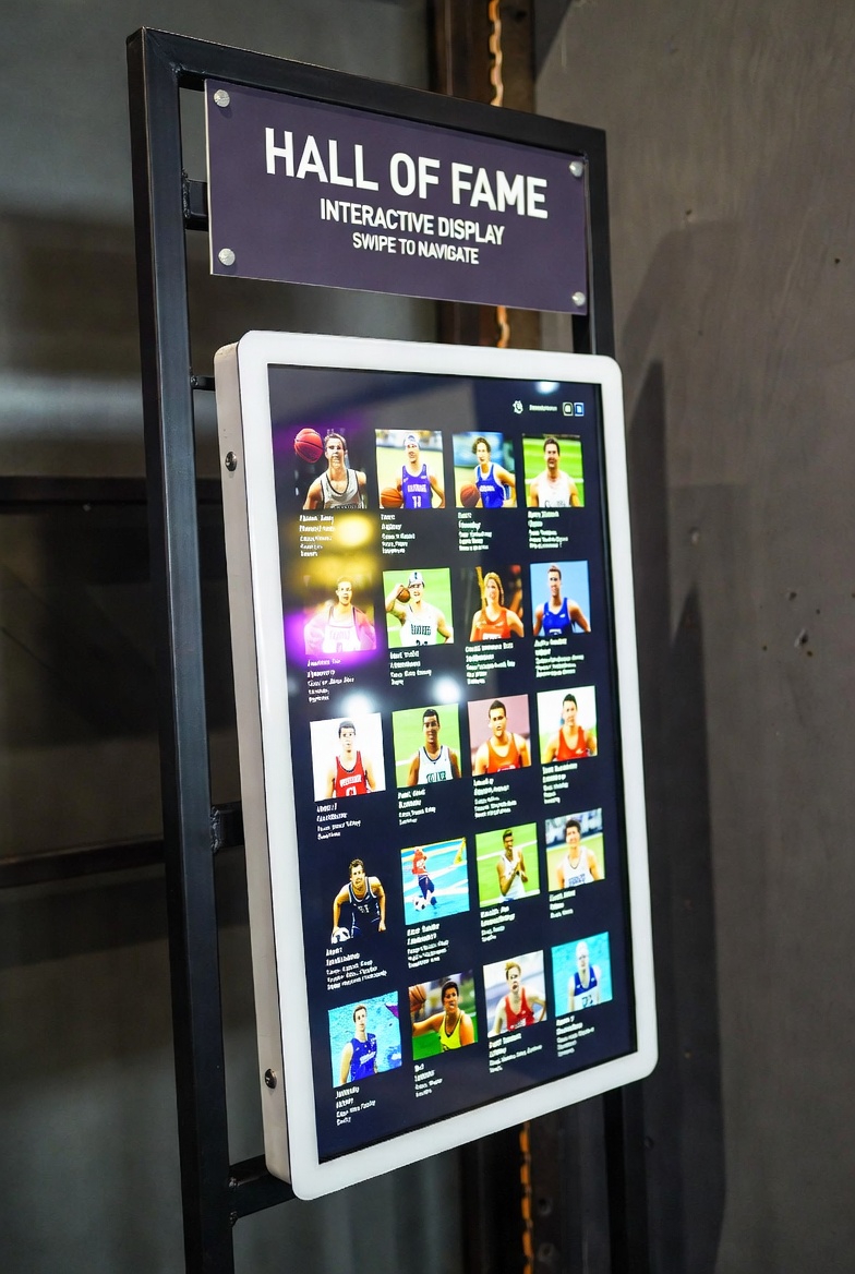
- Minimum Target Size: Interactive elements should be at least 48×48 pixels (or approximately 10-15mm on the physical screen) to ensure they can be hit comfortably.
- Safe Buffers: Provide ample “dead space” between buttons. This prevents accidental triggers and reduces the cognitive load on the user.
- Haptic and Visual Feedback: Since there is no physical click on a glass screen, the UI must provide immediate visual feedback. Buttons should change color, glow, or animate instantly upon touch so the user knows their input was registered.
4. Establish a Clear Content Hierarchy for Public Spaces
In a public space, you are competing for the user’s attention. You have approximately three seconds to answer three questions for the passerby: What is this? Why should I care? What do I do next?
A cluttered interface is a dead interface. You must establish a clear visual hierarchy that guides the user from interest to interaction. We often refer to this as the “3-2-1 Rule”: 3 seconds to catch the eye, 2 minutes of engagement, 1 clear takeaway.
Structuring your content hierarchy:
- The Anchor: One large, high-contrast visual or headline that defines the purpose of the display.
- The Navigational Core: A consistent navigation bar that stays in the same place across all screens. Consistency breeds confidence.
- The Progressive Disclosure: Don’t show everything at once. Use “Read More” buttons or pop-ups to reveal details only when requested. This keeps the primary interface clean and inviting.
- Environmental Context: Consider the surrounding environment. If the display is in a loud sports venue, don’t rely on audio. If it’s in a quiet house of worship, ensure the visuals are respectful and not overly jarring.

5. Implement Seamless QR and Voice Integration
The future of large-scale interaction is “hybrid.” While touch is the primary interface, many users prefer to “take the content with them” or interact without physically touching the screen. This has become increasingly important in post-pandemic design.
Modern interactive displays should act as a bridge between the physical space and the user’s personal device. This is where QR handoffs and voice commands become powerful tools.
Modern interaction standards:
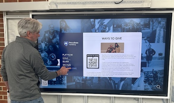
- The QR Handoff: If your display provides a map, a schedule, or a donor list, provide a QR code that allows the user to transfer that data directly to their phone. This extends the life of the interaction far beyond the screen itself.
- Voice Commands: For large-scale walls where a user might be standing back, voice integration can allow for “hands-free” navigation. This is particularly useful for wayfinding in large retail solutions.
- Multi-User Support: Large displays often attract multiple people at once. Design your UI to support multiple touchpoints or “zones” so that two people can interact with different parts of the screen simultaneously without interfering with each other.
Conclusion: Designing for the Human Experience
Creating a successful interactive display is about more than just hardware; it’s about understanding human behavior in a physical environment. By following the “Arm’s Length” rule, prioritizing ADA accessibility, sizing touch targets correctly, maintaining a clean hierarchy, and embracing hybrid technology, you ensure that your investment in digital signage actually delivers value.
At Norvision, we don’t just sell screens; we design experiences. From schools and campus solutions to high-end corporate donor walls, we apply these golden rules to every project we touch.
Don’t get caught up in the “wow factor” at the expense of usability. Make sure your next project is built on a foundation of solid UX principles.
Ready to elevate your space with a world-class interactive display?
Explore our work to see these rules in action, or contact us today to discuss your vision.
Norvision
Digital Signage Solutions That Engage.
About Us | Support | Blog